For this post, we will be using the built-in mtcars dataset, extracted from the 1974 Motor Trend magazine, containing 11 variables describing designs and performance of 32 automobiles.
The correlate() function
We can obtain our correlation table with one line of code:
mtcars %>%correlate()
# A tibble: 11 × 12
   term     mpg    cyl   disp     hp    drat     wt    qsec     vs      am
   <chr>  <dbl>  <dbl>  <dbl>  <dbl>   <dbl>  <dbl>   <dbl>  <dbl>   <dbl>
 1 mpg   NA     -0.852 -0.848 -0.776  0.681  -0.868  0.419   0.664  0.600
 2 cyl   -0.852 NA      0.902  0.832 -0.700   0.782 -0.591  -0.811 -0.523
 3 disp  -0.848  0.902 NA      0.791 -0.710   0.888 -0.434  -0.710 -0.591
 4 hp    -0.776  0.832  0.791 NA     -0.449   0.659 -0.708  -0.723 -0.243
 5 drat   0.681 -0.700 -0.710 -0.449 NA      -0.712  0.0912  0.440  0.713
 6 wt    -0.868  0.782  0.888  0.659 -0.712  NA     -0.175  -0.555 -0.692
 7 qsec   0.419 -0.591 -0.434 -0.708  0.0912 -0.175 NA       0.745 -0.230
 8 vs     0.664 -0.811 -0.710 -0.723  0.440  -0.555  0.745  NA      0.168
 9 am     0.600 -0.523 -0.591 -0.243  0.713  -0.692 -0.230   0.168 NA
10 gear   0.480 -0.493 -0.556 -0.126  0.700  -0.583 -0.213   0.206  0.794
11 carb  -0.551  0.527  0.395  0.750 -0.0908  0.428 -0.656  -0.570  0.0575
# ℹ 2 more variables: gear <dbl>, carb <dbl>
It even tells us it used the Pearson method to calculate the correlations!
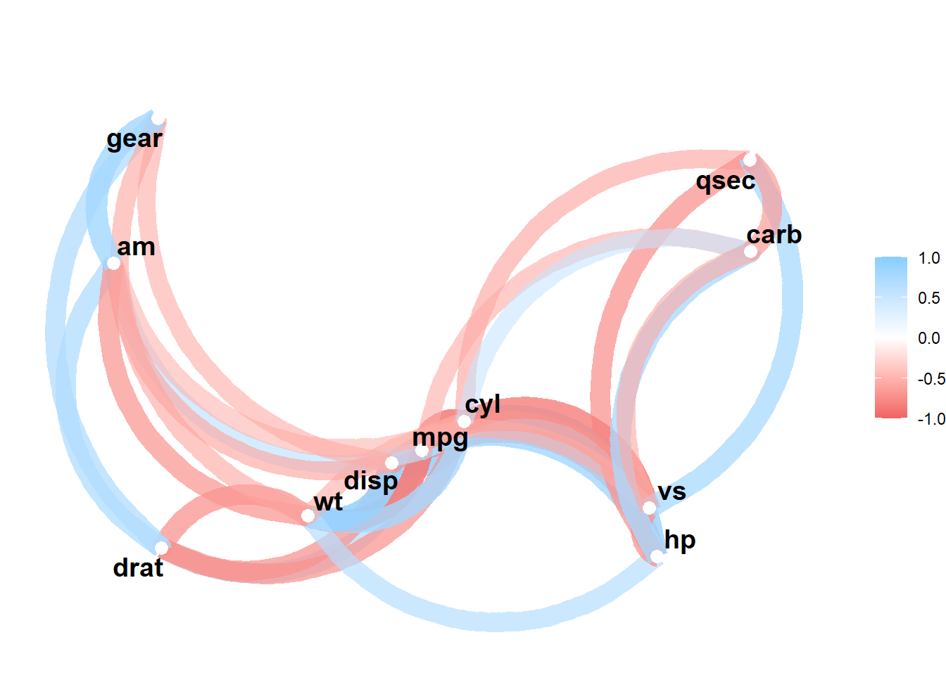
Tidy framework
The corrr package was built following a tidy logic – basically, the usual packages used for data analysis de wrangling (tidyverse, dplyr) can also be used with corrr. This is possible because corrr works on correlations data frames, not matrices. So, while not useful for mathematical calculations, it makes it easier to analyse correlations between variables.
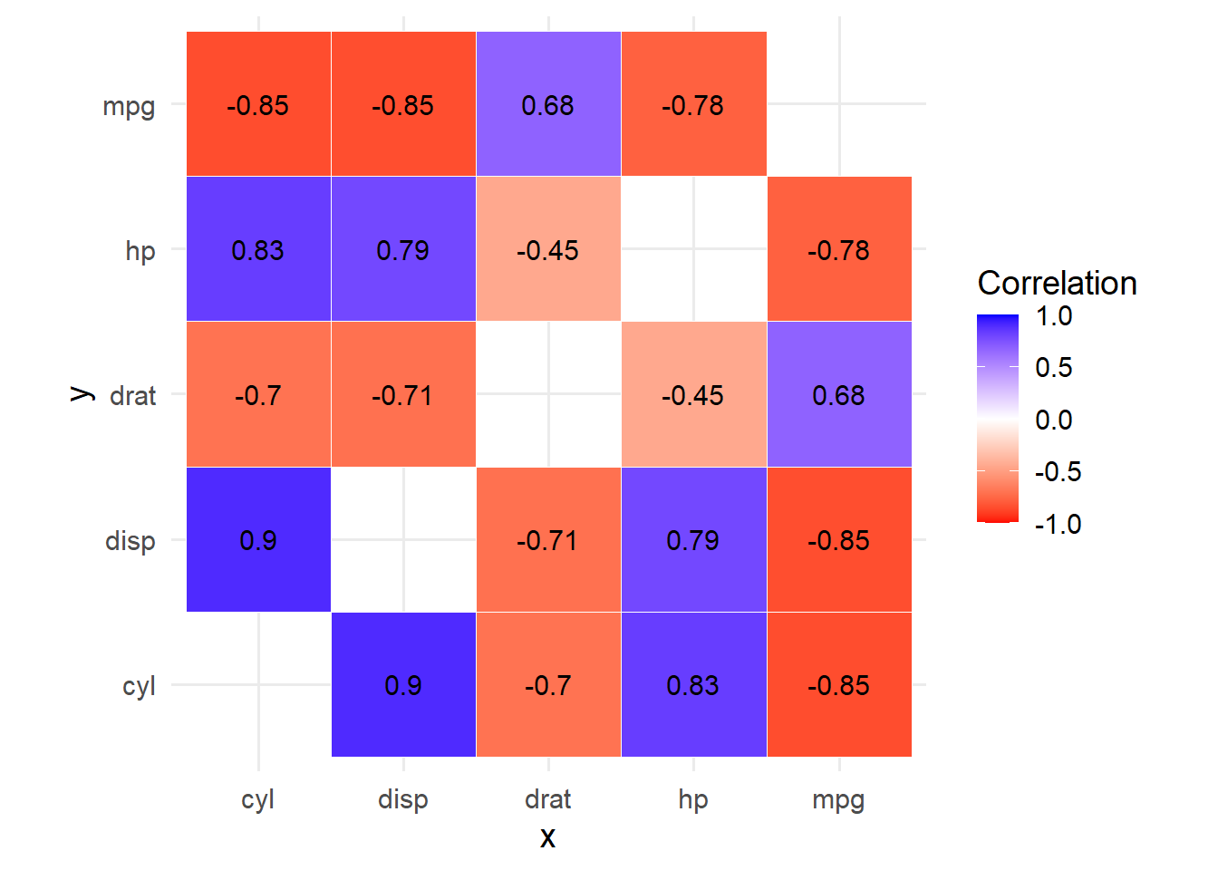
mtcars %>%correlate() %>%stretch(na.rm =TRUE) %>%filter(x %in%c("mpg","cyl","disp","hp","drat"), y %in%c("mpg","cyl","disp","hp","drat")) %>%ggplot(aes(x, y, fill = r)) +geom_tile(color ="white") +geom_text(aes(label =round(r, 2)), color ="black", size =4) +scale_fill_gradient2(low ="red", mid ="white", high ="blue", midpoint =0,limits =c(-1, 1) ) +coord_equal() +theme_minimal(base_size =14) +labs(fill ="Correlation")
Source Code
---title: "Calculating correlations with corrr"date: '2025-09-08'categories: ['eng', 'data analysis', 'explanatory analysis', 'tidyverse']description: 'an easy way to calculate and visualize correlations'execute: message: false warning: falseformat: html: code-tools: true code-summary: 'Code'---The `corrr` package makes calculating correlations significantly quicker and easier than base R.```{r}library(corrr)library(tidyverse)library(dplyr)mtcars```For this post, we will be using the built-in `mtcars` dataset, extracted from the 1974 Motor Trend magazine, containing 11 variables describing designs and performance of 32 automobiles.### The `correlate()` functionWe can obtain our correlation table with one line of code:```{r}mtcars %>%correlate()```It even tells us it used the Pearson method to calculate the correlations!### Tidy frameworkThe `corrr` package was built following a tidy logic – basically, the usual packages used for data analysis de wrangling (`tidyverse`, `dplyr`) can also be used with `corrr`. This is possible because `corrr` works on correlations *data frames*, not matrices. So, while not useful for mathematical calculations, it makes it easier to analyse correlations between variables.```{r}mtcars %>%correlate() %>%focus(mpg, cyl) %>%arrange(desc(mpg))```From this table, the correlations shows that:- Cars with **many cylinders, big engines, high horsepower, heavy weight** → **low mpg, automatic, fewer gears**.- Cars with **fewer cylinders, smaller engines, lighter weight** → **higher mpg, manuals, more gears**.You can also print the full table but exclude either the top or bottom triangle to make it easier to visualize:```{r}mtcars %>%correlate() %>%shave() %>%# upper trianglefocus(mpg:drat, mirror =TRUE) %>%# narrow columns further to better vizfashion()```### Visualizing correlations`corrr` is very easy to visualize. It has its own functions, like `network_plot`, or you can use ggplot2 for customization.```{r}mtcars %>%correlate() %>%network_plot(min_cor =0.5)``````{r}mtcars %>%correlate() %>%stretch(na.rm =TRUE) %>%filter(x %in%c("mpg","cyl","disp","hp","drat"), y %in%c("mpg","cyl","disp","hp","drat")) %>%ggplot(aes(x, y, fill = r)) +geom_tile(color ="white") +geom_text(aes(label =round(r, 2)), color ="black", size =4) +scale_fill_gradient2(low ="red", mid ="white", high ="blue", midpoint =0,limits =c(-1, 1) ) +coord_equal() +theme_minimal(base_size =14) +labs(fill ="Correlation")```