library(tsibble)  # For handling time-series data frames
library(fable)    # For the actual SARIMA (ARIMA) modeling
library(ggtime)   # For visualizing and analyzing patterns
library(ggplot2) # For making the chartsSARIMA
r
econometrics
timeseries
a very simple guide to using SARIMA on R
SARIMA (Seasonal Autoregressive Integrated Moving Average), is an extension of the ARIMA (Autoregressive Integrated Moving Average) model, designed to handle time series data that exhibit seasonal patterns. By combining autoregressive terms, differencing to achieve stationarity, and moving averages for both non-seasonal and seasonal elements, SARIMA provides a robust framework for predicting complex data like retail sales, weather patterns, or economic indicators.
We can implement the SARIMA model in R very easily using the tidyverts ecosystem, a collection of packages for time series analysis following the tidy framework.
We will use data from the classic AirPassangers dataset – monthly totals of international airline passengers (1949–1960) by Box and Jenkins.
We prepare the data by converting it to tsibble, a modern time-series table.
airline_data <- as_tsibble(AirPassengers)

airline_data
# A tsibble: 144 x 2 [1M]
index value
<mth> <dbl>
1 1949 jan 112
2 1949 fev 118
3 1949 mar 132
4 1949 abr 129
5 1949 mai 121
6 1949 jun 135
7 1949 jul 148
8 1949 ago 148
9 1949 set 136
10 1949 out 119
# ℹ 134 more rowsNow, we can fit the SARIMA model using the ARIMA() function, a very smart alternative that automatically tests different seasonal settings to find the one that fits your data best.
fit <- airline_data |>
  model(sarima_forecast = ARIMA(value))
Now we can simply generate the forecast and visualize it with ggplot2
# ask the model to predict the next 2 years
future_flights <- fit |>
  forecast(h = "2 years")

future_flights
# A fable: 24 x 4 [1M]
# Key: .model [1]
.model index
<chr> <mth>
1 sarima_forecast 1961 jan
2 sarima_forecast 1961 fev
3 sarima_forecast 1961 mar
4 sarima_forecast 1961 abr
5 sarima_forecast 1961 mai
6 sarima_forecast 1961 jun
7 sarima_forecast 1961 jul
8 sarima_forecast 1961 ago
9 sarima_forecast 1961 set
10 sarima_forecast 1961 out
# ℹ 14 more rows
# ℹ 2 more variables: value <dist>, .mean <dbl># plot the original data plus our new prediction with confidence intervals
future_flights |>
autoplot(airline_data) +
labs(
title = "International Airline Passengers Forecast",
subtitle = "Predicting the next 2 years using a SARIMA model",
caption = "Source: Box and Jenkins (1976)",
y = "Total Passengers (thousands)",
x = "Year"
) +
theme_minimal()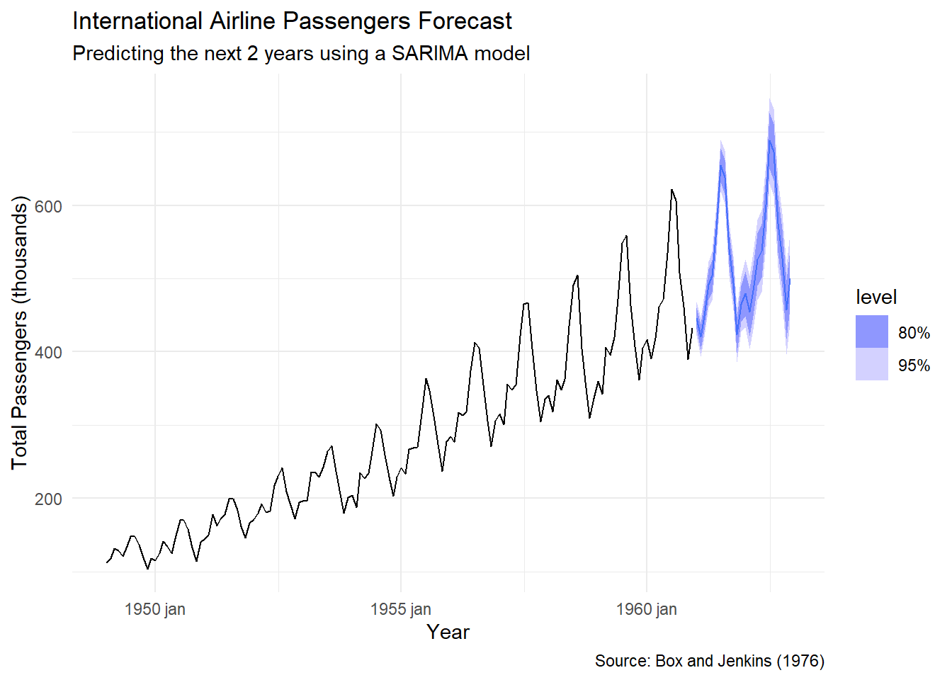
The light and dark blue bands represent 80% and 95% confidence intervals. In simple terms, while the solid line is our best guess, the shaded areas show the range where the actual numbers are most likely to land. The further into the future we go, the wider these bands get, reflecting the natural uncertainty of long-term forecasting.