Code
library(pacman)
pacman :: p_load(tidytuesdayR, tidyverse, dplyr, janitor, ggtext, showtext, scales, glue, waffle)

tuesdata <- tidytuesdayR::tt_load('2025-10-28')
prizes <- tuesdata$prizesThis week challenge dataset in on Selected British Literary Prizes (1990-2022). Check the TidyTuesday GitHub repo for the data.
library(pacman)
pacman :: p_load(tidytuesdayR, tidyverse, dplyr, janitor, ggtext, showtext, scales, glue, waffle)
tuesdata <- tidytuesdayR::tt_load('2025-10-28')
prizes <- tuesdata$prizesmy_theme <- function(gridline_x = TRUE, gridline_y = TRUE) {
gridline <- element_line(
linetype = "dashed",
linewidth = 0.15,
color = "#999999"
)
gridline_x <- if (isTRUE(gridline_x)) {
gridline
} else {
element_blank()
}
gridline_y <- if (isTRUE(gridline_y)) {
gridline
} else {
element_blank()
}
# Set base theme =============================================
theme_minimal() +
# Overwrite base theme defaults ============================================
theme(
# Text elements ==========================================================
plot.title = element_text(
size = 18,
face = "bold",
color = "#333333",
margin = margin(b = 10)
),
plot.subtitle = element_text(
size = 14,
color = "#999999",
margin = margin(b = 10)
),
plot.caption = element_text(
size = 13,
color = "#777777",
margin = margin(t = 15),
hjust = 0
),
axis.text = element_text(
size = 11,
color = "#333333"
),
plot.title.position = "plot",
plot.caption.position = "plot",
# Line elements ==========================================================
panel.grid.minor = element_blank(),
panel.grid.major.x = gridline_x,
panel.grid.major.y = gridline_y,
axis.ticks.x = element_line(
linetype = "solid",
linewidth = 0.25,
color = "#999999"
),
axis.ticks.length.x = unit(4, units = "pt")
)
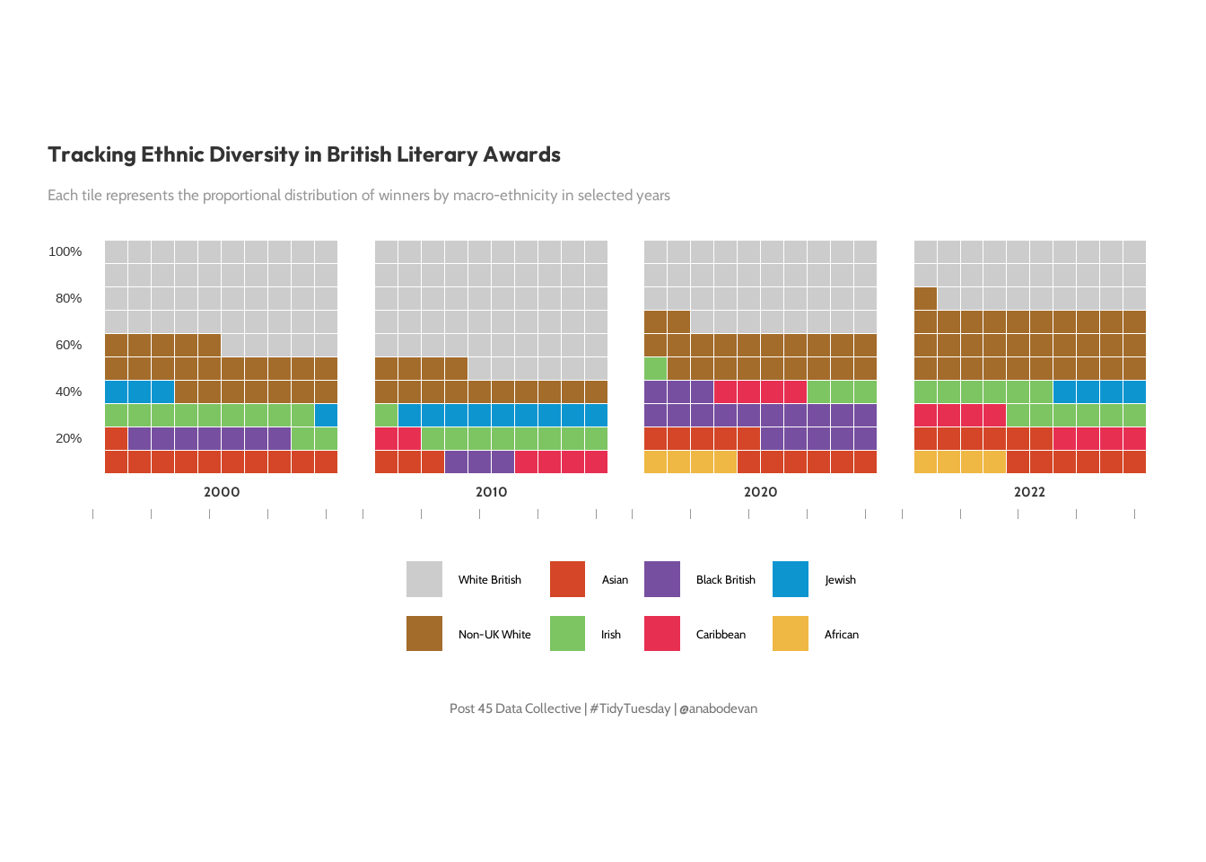
} #### thanks r for the rest of us For this plot, I am interested in the proportion of prizes awarded by macro ethinicity
tuesdata$prizes |>
  count(prize_year, ethnicity_macro, sort = TRUE) |>
  group_by(prize_year) |>
  mutate(per = n / sum(n)) |>
  ungroup() |>
  group_by(ethnicity_macro) |>
  filter(n() > 10) |>
  ungroup() |>
  ggplot(aes(y = per, x = prize_year)) +
  geom_line(aes(color = ethnicity_macro)) +
  geom_point(aes(color = ethnicity_macro), size = 1) +
  my_theme()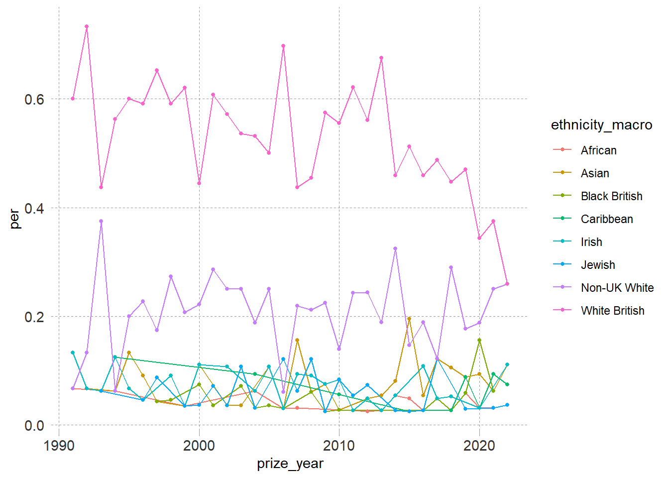
Now to prepare the data for plotting.
# Check what ethnicity values exist in  data
prizes |>
  filter(prize_year %in% c(2000, 2010, 2020, 2022)) |>
  count(ethnicity_macro, sort = TRUE)
# A tibble: 9 × 2
ethnicity_macro n
<chr> <int>
1 White British 50
2 Non-UK White 24
3 Asian 10
4 Irish 10
5 Black British 8
6 Non-White American 8
7 Caribbean 5
8 Jewish 5
9 African 2waffle_year_data <- prizes |>
filter(prize_year %in% c(2000, 2010, 2020, 2022)) |>
filter(!is.na(ethnicity_macro)) |> # Remove NA values
filter(ethnicity_macro %in% c("African", "Asian", "Black British", "Caribbean",
"Irish", "Jewish", "Non-UK White", "White British")) |>
group_by(prize_year, ethnicity_macro) |>
summarise(total = n(), .groups = "drop") |>
ungroup() |>
complete(
prize_year = c(2000, 2010, 2020, 2022),
ethnicity_macro = c("African", "Asian", "Black British", "Caribbean",
"Irish", "Jewish", "Non-UK White", "White British"),
fill = list(total = 0)
) |>
group_by(prize_year) |>
mutate(prop = total / sum(total)) |>
ungroup()
# 3. Consistent order and square calculation
ethnicity_order <- waffle_year_data |>
count(ethnicity_macro, wt = total, sort = TRUE) |>
pull(ethnicity_macro)
waffle_year <- waffle_year_data |>
mutate(
ethnicity_macro = factor(ethnicity_macro, levels = ethnicity_order),
n_squares = as.integer(round(prop * 100))
) |>
group_by(prize_year) |>
mutate(n_squares = {
diff <- 100 - sum(n_squares)
if (diff > 0) {
n_squares[which.max(n_squares)] <- n_squares[which.max(n_squares)] + diff
} else if (diff < 0) {
n_squares[which.max(n_squares)] <- n_squares[which.max(n_squares)] + diff
}
n_squares
}) |>
ungroup()
# Verify the data before plotting
waffle_year |>
group_by(prize_year) |>
summarise(
total_squares = sum(n_squares),
ethnicities = paste(unique(ethnicity_macro), collapse = ", ")
)# A tibble: 4 × 3
prize_year total_squares ethnicities
<dbl> <dbl> <chr>
1 2000 100 African, Asian, Black British, Caribbean, Irish, Jew…
2 2010 100 African, Asian, Black British, Caribbean, Irish, Jew…
3 2020 100 African, Asian, Black British, Caribbean, Irish, Jew…
4 2022 100 African, Asian, Black British, Caribbean, Irish, Jew…First let’s set fonts and colors to complement the theme.
font_add_google("Outfit", "title_font")
font_add_google("Cabin", "body_font")
showtext_auto()

title_font <- "title_font"
body_font <- "body_font"

title_text <- "Tracking Ethnic Diversity in British Literary Awards"
subtitle_text <- "Each tile represents the proportional distribution of winners by macro-ethnicity in selected years"
caption_text <- "Post 45 Data Collective | #TidyTuesday | @anabodevan"


pal <- c("African" = "#EFB743",
          "Asian" = "#D44627",
          "Black British" = "#774FA0",
          "Caribbean" = "#E72F52",
          "Irish" = "#7DC462",
          "Jewish" = "#0D95D0",
          "Non-UK White" = "#A36C2B",
          "White British" = "#cccccc")
Now, to the plot
p <- ggplot(waffle_year, aes(fill = ethnicity_macro, values = n_squares)) +
  geom_waffle(color = "white", size = 0.3, n_rows = 10, flip = TRUE) +
  facet_wrap(~prize_year, nrow = 1, strip.position = "bottom") +


  scale_fill_manual(values = pal, name = "") +


  scale_y_continuous(
    breaks = seq(0, 10, by = 2),
    labels = c("0%", "20%", "40%", "60%", "80%", "100%"),
    expand = c(0,0)
  ) +
  coord_equal() +

  labs(title = title_text,
       subtitle = subtitle_text,
       caption = caption_text) +

  my_theme(gridline_x = FALSE, gridline_y = FALSE) +

  theme(
    # Keep Y-axis text (numbers) but remove X-axis text
    axis.text.x = element_blank(),
    # Hide ticks and title
    axis.ticks = element_blank(),
    axis.title = element_blank(),

    # Stylize the year labels (strip text)
    strip.text = element_text(family = body_font, size = 11, face = "bold", color = "#333333", margin = margin(t = 5, b = 5)),

    legend.position = "bottom",
    legend.text = element_text(family = body_font, size = 10),

    plot.title = element_text(family = title_font, size = 18, hjust = 0, face = "bold"),

    plot.subtitle = element_text(family = body_font, size = 13, hjust = 0, margin = margin(b = 15)),

    plot.caption = element_text(family = body_font, size = 11, hjust = 0.5),

    plot.margin = margin(t = 20, r = 20, b = 20, l = 20)
  )

print(p)