Code
library(pacman)
pacman :: p_load(tidytuesdayR, tidyverse, dplyr, janitor, ggtext, showtext, scales, glue)
tuesdata <- tidytuesdayR::tt_load('2025-11-11')Ana Luisa Bodevan
November 11, 2025
This week challenge dataset in on WHO TB Burden Data. Check the TidyTuesday GitHub repo for the data.
my_theme <- function(gridline_x = TRUE, gridline_y = TRUE) {
gridline <- element_line(
linetype = "dashed",
linewidth = 0.15,
color = "#999999"
)
gridline_x <- if (isTRUE(gridline_x)) {
gridline
} else {
element_blank()
}
gridline_y <- if (isTRUE(gridline_y)) {
gridline
} else {
element_blank()
}
# Set base theme =============================================
theme_minimal() +
# Overwrite base theme defaults ============================================
theme(
# Text elements ==========================================================
plot.title = element_text(
size = 18,
face = "bold",
color = "#333333",
margin = margin(b = 10)
),
plot.subtitle = element_text(
size = 14,
color = "#999999",
margin = margin(b = 10)
),
plot.caption = element_text(
size = 13,
color = "#777777",
margin = margin(t = 15),
hjust = 0
),
axis.text = element_text(
size = 11,
color = "#333333"
),
plot.title.position = "plot",
plot.caption.position = "plot",
# Line elements ==========================================================
panel.grid.minor = element_blank(),
panel.grid.major.x = gridline_x,
panel.grid.major.y = gridline_y,
axis.ticks.x = element_line(
linetype = "solid",
linewidth = 0.25,
color = "#999999"
)
)
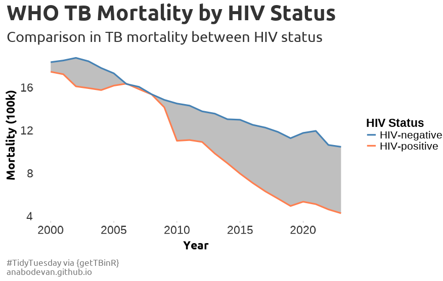
} #### thanks r for the rest of usFor this one, we will be exploring the correlation between HIV status and Tuberculosis mortality.
ggplot(df, aes(x = year)) +
geom_ribbon(aes(ymin = mean_positive, ymax = mean_negative),
fill = "gray80", alpha = 0.5) +
geom_line(aes(y = mean_positive, color = "HIV-positive"), linewidth = 1.2) +
geom_line(aes(y = mean_negative, color = "HIV-negative"), linewidth = 1.2) +
my_theme(gridline_x = FALSE, gridline_y = FALSE)font_add_google("Ubuntu", "ubuntu")
showtext_auto()
showtext_opts(dpi = 150)
ggplot(df, aes(x = year)) +
geom_ribbon(aes(ymin = mean_positive, ymax = mean_negative),
fill = "gray50", alpha = 0.5) +
geom_line(aes(y = mean_positive, color = "HIV-positive"), linewidth = 1.2) +
geom_line(aes(y = mean_negative, color = "HIV-negative"), linewidth = 1.2) +
scale_color_manual(values = c("HIV-positive" = "#ff7f50", "HIV-negative" = "#4682b4"))+
labs(title = "WHO TB Mortality by HIV Status",
subtitle = "Comparison in TB mortality between HIV status",
caption = "#TidyTuesday via {getTBinR}\nanabodevan.github.io",
color = "HIV Status",
y = "Mortality (100k)",
x = "Year") +
my_theme(gridline_x = FALSE, gridline_y = FALSE) +
theme(
# Title + subtitle styling
plot.title = element_text(
size = 20, hjust = 0, family = "ubuntu"
),
plot.subtitle = element_text(
size = 14,
family = "ubuntu",
color = "gray20",
lineheight = 1.5, # increases distance between lines
margin = margin(t = 5, b = 10) # extra spacing below subtitle
),
plot.caption = element_text(size = 8, hjust = 0, family = "ubuntu", lineheight = 1.5),
axis.title.x = element_text(
margin = margin(t = 15),
family = "ubuntu",
face = "bold"
),
axis.title.y = element_text(margin = margin(r = 15),
family = "ubuntu",
face = "bold"),
legend.title = element_text(face = "bold", size = 11),
legend.text = element_text(size = 10),
legend.position = "right",
plot.margin = margin(20,40,20,20))
---
title: "WHO TB Burden Data"
author: "Ana Luisa Bodevan"
date: "2025-11-11"
categories: [line chart, timeseries, health]
image: "20251111.png"
execute:
warning: false
message: false
eval: false
format:
html:
code-tools: true
code-fold: true
page-layout: full
---
This week challenge dataset in on WHO TB Burden Data. Check the [TidyTuesday](https://github.com/rfordatascience/tidytuesday/blob/main/data/2025/2025-11-11/readme.md) GitHub repo for the data.
## 1. SETUP
### 1.1 Load libraries and data
```{r}
#| label: load libraries and data
library(pacman)
pacman :: p_load(tidytuesdayR, tidyverse, dplyr, janitor, ggtext, showtext, scales, glue)
tuesdata <- tidytuesdayR::tt_load('2025-11-11')
```
### 1.2 Set theme
```{r}
#| label: set theme
my_theme <- function(gridline_x = TRUE, gridline_y = TRUE) {
gridline <- element_line(
linetype = "dashed",
linewidth = 0.15,
color = "#999999"
)
gridline_x <- if (isTRUE(gridline_x)) {
gridline
} else {
element_blank()
}
gridline_y <- if (isTRUE(gridline_y)) {
gridline
} else {
element_blank()
}
# Set base theme =============================================
theme_minimal() +
# Overwrite base theme defaults ============================================
theme(
# Text elements ==========================================================
plot.title = element_text(
size = 18,
face = "bold",
color = "#333333",
margin = margin(b = 10)
),
plot.subtitle = element_text(
size = 14,
color = "#999999",
margin = margin(b = 10)
),
plot.caption = element_text(
size = 13,
color = "#777777",
margin = margin(t = 15),
hjust = 0
),
axis.text = element_text(
size = 11,
color = "#333333"
),
plot.title.position = "plot",
plot.caption.position = "plot",
# Line elements ==========================================================
panel.grid.minor = element_blank(),
panel.grid.major.x = gridline_x,
panel.grid.major.y = gridline_y,
axis.ticks.x = element_line(
linetype = "solid",
linewidth = 0.25,
color = "#999999"
)
)
} #### thanks r for the rest of us
```
## 2. DATA WRANGLING
For this one, we will be exploring the correlation between HIV status and Tuberculosis mortality.
### 2.1 Check correlation
```{r}
tuesdata$who_tb_data |>
ggplot(aes(x = c_newinc_100k, y = e_mort_tbhiv_100k)) +
geom_point()
```
### 2.2 Get mean mortality
```{r}
df <-
tuesdata$who_tb_data |>
group_by(year) |>
summarise(mean_positive = mean(e_mort_tbhiv_100k, na.rm = T),
mean_negative = mean(e_mort_exc_tbhiv_100k, na.rm = T)) |>
ungroup() |>
pivot_longer(cols = c(mean_positive, mean_negative))
df <- df |>
pivot_wider(names_from = name, values_from = value)
```
## 3. PLOT
### 3.1 Base plot
```{r}
ggplot(df, aes(x = year)) +
geom_ribbon(aes(ymin = mean_positive, ymax = mean_negative),
fill = "gray80", alpha = 0.5) +
geom_line(aes(y = mean_positive, color = "HIV-positive"), linewidth = 1.2) +
geom_line(aes(y = mean_negative, color = "HIV-negative"), linewidth = 1.2) +
my_theme(gridline_x = FALSE, gridline_y = FALSE)
```
### 3.2 Plot
```{r}
font_add_google("Ubuntu", "ubuntu")
showtext_auto()
showtext_opts(dpi = 150)
ggplot(df, aes(x = year)) +
geom_ribbon(aes(ymin = mean_positive, ymax = mean_negative),
fill = "gray50", alpha = 0.5) +
geom_line(aes(y = mean_positive, color = "HIV-positive"), linewidth = 1.2) +
geom_line(aes(y = mean_negative, color = "HIV-negative"), linewidth = 1.2) +
scale_color_manual(values = c("HIV-positive" = "#ff7f50", "HIV-negative" = "#4682b4"))+
labs(title = "WHO TB Mortality by HIV Status",
subtitle = "Comparison in TB mortality between HIV status",
caption = "#TidyTuesday via {getTBinR}\nanabodevan.github.io",
color = "HIV Status",
y = "Mortality (100k)",
x = "Year") +
my_theme(gridline_x = FALSE, gridline_y = FALSE) +
theme(
# Title + subtitle styling
plot.title = element_text(
size = 20, hjust = 0, family = "ubuntu"
),
plot.subtitle = element_text(
size = 14,
family = "ubuntu",
color = "gray20",
lineheight = 1.5, # increases distance between lines
margin = margin(t = 5, b = 10) # extra spacing below subtitle
),
plot.caption = element_text(size = 8, hjust = 0, family = "ubuntu", lineheight = 1.5),
axis.title.x = element_text(
margin = margin(t = 15),
family = "ubuntu",
face = "bold"
),
axis.title.y = element_text(margin = margin(r = 15),
family = "ubuntu",
face = "bold"),
legend.title = element_text(face = "bold", size = 11),
legend.text = element_text(size = 10),
legend.position = "right",
plot.margin = margin(20,40,20,20))
```
{fig-align="center" width="572"}