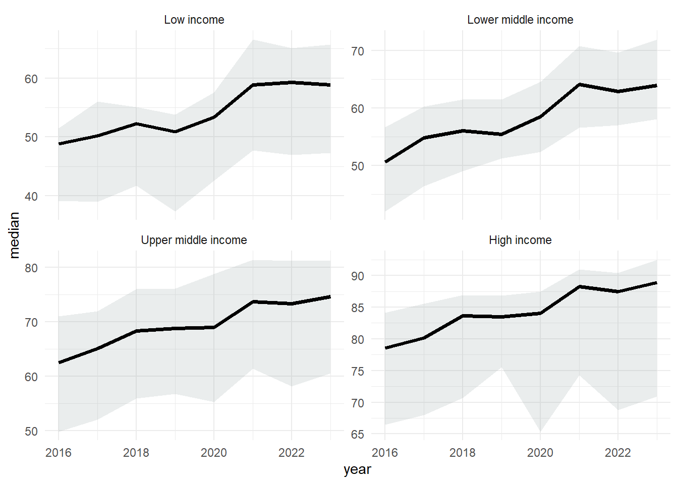
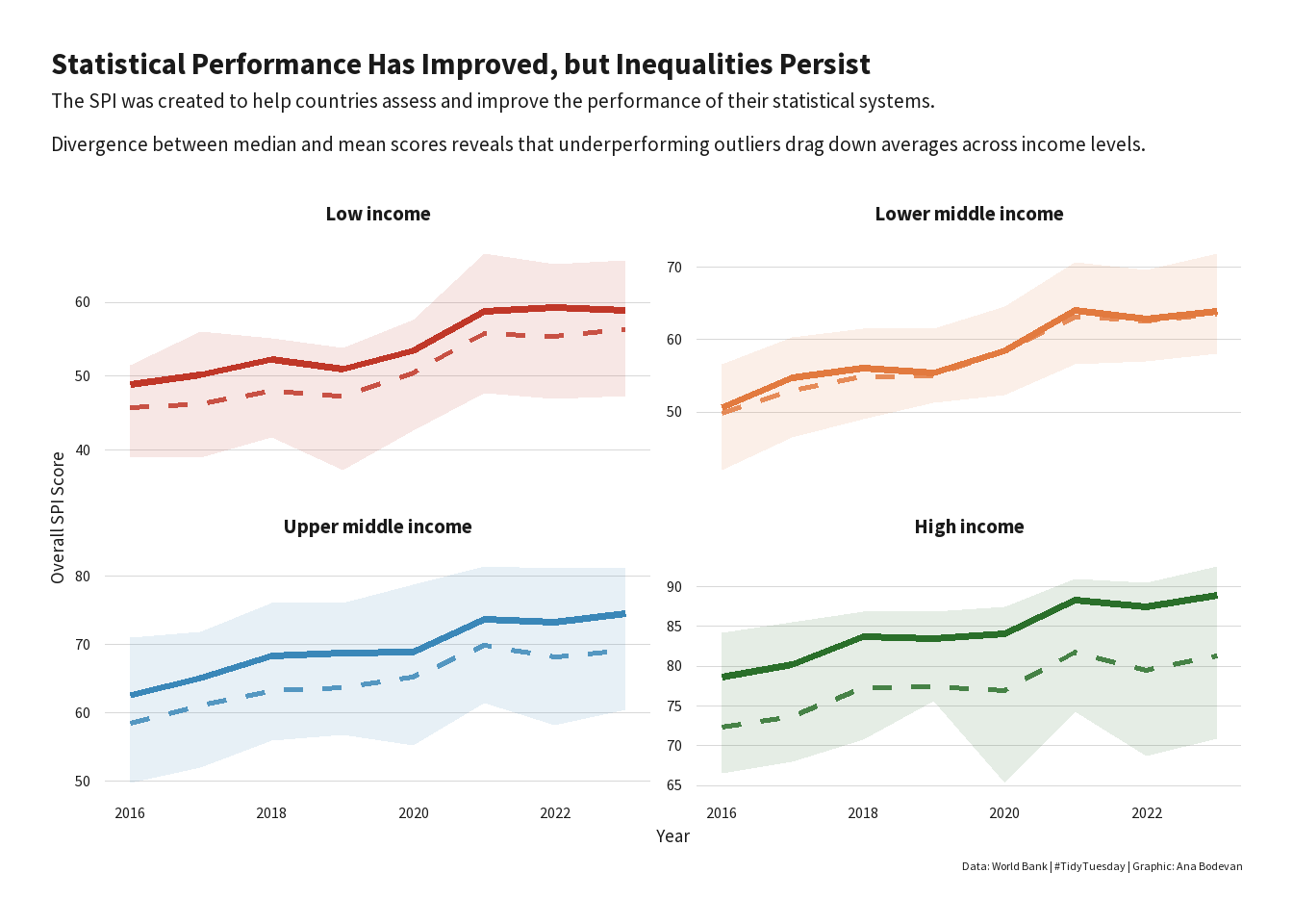
--- title: "World Bank SPI" author: "Ana Luisa Bodevan" date: "2025-11-25" categories: [line chart, timeseries] image: "20251125.png" execute: warning: false message: false eval: true format: html: code-tools: true code-fold: true --- [ TidyTuesday ](https://github.com/rfordatascience/tidytuesday/blob/main/data/2025/2025-11-25/readme.md) GitHub repo for the data.## 1. SETUP ### 1.1 Load libraries and data ```{r} #| label: load libraries and data library (pacman):: p_load (tidytuesdayR, tidyverse, dplyr, janitor, ggtext, showtext, scales, glue, ggrepel)<- tidytuesdayR:: tt_load ('2025-11-25' )<- tuesdata$ spi_indicators |> :: clean_names ()rm (tuesdata)``` ## 2. DATA WRANGLING ```{r} <- spi_indicators |> mutate (year = as.integer (year),income = factor (levels = c ("Low income" ,"Lower middle income" ,"Upper middle income" ,"High income" |> filter (! is.na (overall_score),! is.na (income))<- spi |> group_by (income, year) |> summarise (median = median (overall_score, na.rm = TRUE ),mean = mean (overall_score, na.rm = TRUE ),p25 = quantile (overall_score, .25 , na.rm = TRUE ),p75 = quantile (overall_score, .75 , na.rm = TRUE ),.groups = "drop" ``` ```{r} ggplot (spi_summary, aes (x = year, y = median)) + geom_ribbon (aes (ymin = p25, ymax = p75), alpha = 0.2 , fill = "#95a5a6" ) + geom_line (linewidth = 1.4 , color = "black" ) + facet_wrap (~ income, scales = "free_y" ) + theme_minimal ()``` ```{r} <- max (spi_summary$ year, na.rm = TRUE )<- spi_summary |> filter (year == latest_year, income %in% c ("High income" , "Low income" )) |> select (income, median) |> :: pivot_wider (names_from = income, values_from = median) |> mutate (gap = ` High income ` - ` Low income ` )<- round (gap_df$ gap, 1 )``` ## 3. PLOT ### 3.1 Fonts and colors ```{r} font_add_google ("Source Sans Pro" , "source_sans" )showtext_auto ()<- "Statistical Performance Has Improved, but Inequalities Persist" <- glue ("The SPI was created to help countries assess and improve the performance of their statistical systems. \n Divergence between median and mean scores reveals that underperforming outliers drag down averages across income levels." <- "Data: World Bank | #TidyTuesday | Graphic: Ana Bodevan" <- c ("Low income" = "#C03728" ,"Lower middle income" = "#E27A3F" ,"Upper middle income" = "#3A87B8" ,"High income" = "#2A6F2A" ``` ### 3.2 Theme ```{r} <- function (base_size = 13 , base_family = "source_sans" ) {theme_minimal (base_size = base_size, base_family = base_family) %+replace% theme (text = element_text (family = base_family, color = "#1A1A1A" ),# ---- Title + Subtitle Left Aligned ---- plot.title.position = "plot" ,plot.title = element_text (size = base_size * 1.8 ,face = "bold" ,hjust = 0 ,margin = margin (b = 6 )plot.subtitle = element_text (size = base_size * 1.2 ,hjust = 0 ,margin = margin (b = 12 )# ---- Axis + Grid ---- axis.title = element_text (size = base_size * 1.1 ),axis.text = element_text (size = base_size * 0.9 ),panel.grid.major.x = element_blank (),panel.grid.major.y = element_line (color = "#D8D8D8" , linewidth = 0.3 ),panel.grid.minor = element_blank (),# ---- Facet titles (strip) ---- strip.text = element_text (size = base_size * 1.2 ,face = "bold" ,margin = margin (t = 8 , b = 8 )# ---- Layout + Padding ---- plot.margin = margin (20 , 20 , 20 , 20 ),legend.position = "none" ,plot.caption.position = "plot" ``` ### 3.3 Plot ```{r} ggplot (spi_summary, aes (x = year)) + # IQR ribbon (soft World Bank-style shading) geom_ribbon (aes (ymin = p25, ymax = p75, fill = income),alpha = 0.12 + # Median (solid) geom_line (aes (y = median, color = income),linewidth = 1.3 + # Mean (dashed) geom_line (aes (y = mean, color = income),linewidth = 1 ,linetype = "dashed" ,alpha = 0.85 + # Manual colors, legend removed above scale_color_manual (values = wb_colors) + scale_fill_manual (values = wb_colors) + # 2×2 layout (side-by-side) facet_wrap (~ income, ncol = 2 , scales = "free_y" ) + labs (title = title,subtitle = subtitle,caption = caption,x = "Year" ,y = "Overall SPI Score" + theme_worldbank ()```