Can an exploding snowman predict the summer season?

scatterplot
science
Author

Ana Luisa Bodevan

Published

December 2, 2025

This week challenge dataset in on Can an exploding snowman predict the summer season?. Check the TidyTuesday GitHub repo for the data.

1. SETUP

Code
library(pacman)

pacman::p_load(
  tidytuesdayR,
  tidyverse,
  dplyr,
  janitor,
  ggtext,
  showtext,
  scales,
  glue,
  skimr,
  ggbranding
)

tuesdata <- tidytuesdayR::tt_load('2025-12-02')

df <- tuesdata$sechselaeuten |>
  janitor :: clean_names()

rm(tuesdata)

2. DATA ANALYSIS

Code
skim(df)
Data summary
Name df
Number of rows 67
Number of columns 9
_______________________
Column type frequency:
logical 1
numeric 8
________________________
Group variables None

Variable type: logical

skim_variable n_missing complete_rate mean count
record 0 1 0.16 FAL: 56, TRU: 11

Variable type: numeric

skim_variable n_missing complete_rate mean sd p0 p25 p50 p75 p100 hist
year 0 1.00 1990.19 21.72 1923.00 1974.50 1991.00 2007.50 2025.00 ▁▂▇▇▇
duration 2 0.97 17.64 11.87 4.00 10.00 13.00 23.50 60.00 ▇▅▁▁▁
tre200m0 0 1.00 17.61 1.34 15.07 16.69 17.50 18.31 21.67 ▃▇▃▂▁
tre200mn 0 1.00 8.38 1.25 6.10 7.38 8.43 9.21 11.40 ▅▃▇▃▁
tre200mx 0 1.00 30.64 1.62 27.50 29.46 30.53 31.69 34.57 ▂▇▇▂▂
sre000m0 0 1.00 213.12 29.14 143.70 195.40 210.42 229.90 284.66 ▂▅▇▃▂
sremaxmv 0 1.00 49.75 6.84 33.33 45.16 49.33 53.50 67.00 ▂▃▇▃▁
rre150m0 0 1.00 126.80 32.17 52.83 103.87 126.03 147.38 186.90 ▁▆▇▆▅
Code
skimr::skim(df) |> summary()
Data summary
Name df
Number of rows 67
Number of columns 9
_______________________
Column type frequency:
logical 1
numeric 8
________________________
Group variables None
Code
cor(df$duration, df$tre200m0, use = "complete.obs")
[1] 0.194294

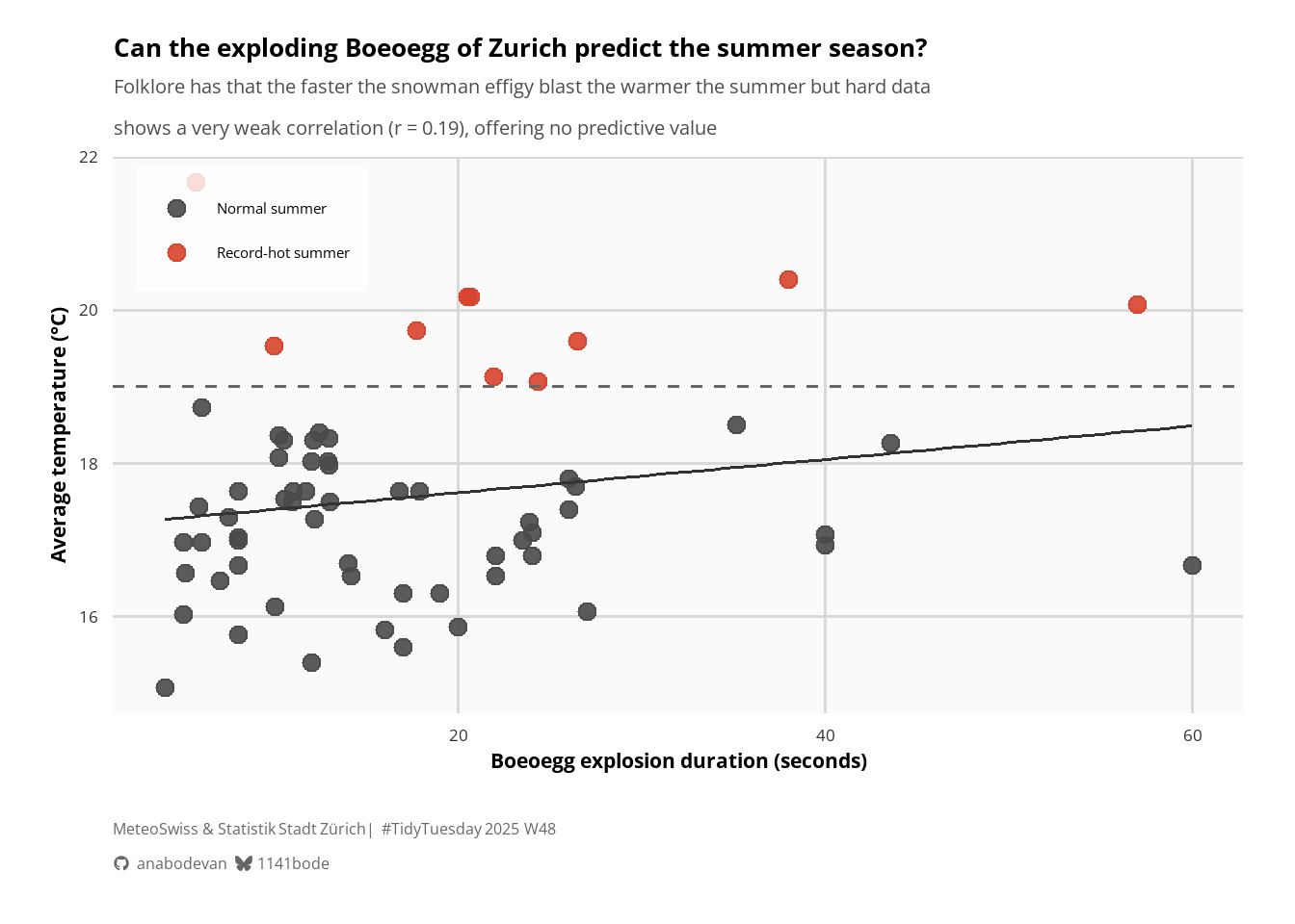
So, the correlation between Boeoegg explosion duration and average summer temperature is positive but extremely weak (r = 0.19), offering no real predictive value for summer heat.

3. DATA TIDYING

Code
df_plot <- df |>
  select(year, duration, tre200m0, record) |>
  mutate(
    record = if_else(record, "Record-hot summer", "Normal summer"),
    record = factor(record, levels = c("Normal summer", "Record-hot summer"))
  )

corr_val <- cor(df_plot$duration, df_plot$tre200m0, use = "complete.obs")
corr_lab <- glue("Pearson r = {round(corr_val, 2)}")

4. PLOT

Code
col <- c(
  "Normal summer" = "#4A4A4A",
  "Record-hot summer" = "#D8432D"
)
Code
font_add_google("Open Sans", "opensans")
showtext_auto()

title <- "Can the exploding Boeoegg of Zurich predict the summer season?"
subtitle <- glue("Folklore has that the faster the snowman effigy blast the warmer the summer but hard data \nshows a very weak correlation (r = 0.19), offering no predictive value")
Code
base_theme <- function(base_size = 14, base_family = "opensans") {
  theme_minimal(base_size = base_size, base_family = base_family) +
    theme(
      # Backgrounds
      panel.background = element_rect(fill = "grey98", color = NA),
      plot.background = element_rect(fill = "white", color = NA),

      # Gridlines (Nature uses strong horizontal gridlines)
      panel.grid.major = element_line(color = "grey85", linewidth = 0.6),
      panel.grid.minor = element_blank(),

      # Axes
      axis.title = element_text(size = base_size * 1.1, face = "bold"),
      axis.text = element_text(size = base_size * 0.9, color = "grey20"),

      # Titles
      plot.title = element_text(size = base_size * 1.4, face = "bold"),
      plot.subtitle = element_text(size = base_size * 1.05, color = "grey30"),

      # Legend
      legend.position = c(0.02, 0.98),
      legend.justification = c("left", "top"),
      legend.background = element_rect(fill = alpha("white", 0.8), color = NA),
      legend.title = element_blank(),

      # Margins
      plot.margin = margin(t = 15, r = 20, b = 15, l = 20)
    )
}
Code
ggplot(df_plot, aes(duration, tre200m0, color = record)) +
  geom_point(size = 3, alpha = 0.9) +

  geom_smooth(
    method = "lm",
    linewidth = 0.6,
    color = "gray20",
    se = FALSE,
    alpha = 0.5
  ) +

  geom_hline(
    yintercept = 19,
    linetype = "dashed",
    linewidth = 0.6,
    color = "grey40"
  ) +

  scale_color_manual(values = col) +

  labs(
    title = title,
    subtitle = subtitle,
    x = "Boeoegg explosion duration (seconds)",
    y = "Average temperature (°C)"
  ) +
  base_theme() +
  add_branding(
    github = "anabodevan",
    bluesky = "1141bode",
    additional_text = "MeteoSwiss & Statistik Stadt Zürich | #TidyTuesday 2025 W48",
    line_spacing = 1L,
    icon_color = "gray40",
    text_color = "gray40",
    icon_size = "12pt", # larger icons
    text_size = "12pt", # larger text,
    text_family = "opensans", # custom font
    caption_margin = ggplot2::margin(t = 20, b = 5, unit = "pt") # custom margin
  )